Custom column showing $1 Gains/Declines


Category:
0
0

Hi Pete,

I’d like a custom column showing how often a stock has gained/declined $1 in a trading day over an X time frame. Ex: ABC open at $9, close at $10.30. DEF open at $12.50, close at $11.25.

Thank you.

Marked as spam
Posted by (Questions: 20, Answers: 27)
Asked on September 13, 2020 3:12 pm
67 views
0
Thanks for posting this again in the Watchlist topic. The previous post has been deleted so we need all of the details included in this post. For the examples you provided, you would want the column to display a value of 1 for ABC and a value of -1 for DEF? Please explain what is "over an x time frame".
( at September 13, 2020 3:44 pm)
0
Is it possible for the time frame to have a customized input? Sometimes I'd like it to be over 5 days while other times over a month. Yes on the display value. For example, let's say ABC stock has had 12 +1$ and 5 -$1 moves, I'd like two columns so that I can see the comparison. Thanks again Pete!
( at September 13, 2020 8:58 pm)
0
I'm not sure you realize the level of detail required for this specification. Might seem very simple to you but as I look at this I find many different paths one could follow to arrive at a solution. Each of them resulting in vastly different outcomes. Every computation has at least two components. In this case I have no idea where the starting and ending points are for your first computation. Do we measure from the previous day close to the current day's high/low? The previous day's close to the current day's close? The current day's open to the current day's close? The current day's open to the current day's high/low? What if a stock gains $1 and then declines $1, does that day get a value of $0 or is it counted as plus 1 in one column and minus 1 in the other. I could go on but I will run about of space to type.
( at September 14, 2020 8:21 am)
0
My bad Pete. I'm looking for the previous day's close to the current day's close. Example over the past month: APPL Pos $1: 8. Neg $1: 3
( at September 14, 2020 8:27 am)
0
Private answer

I think I might have all the details required to get this working. From the comments section above we have the following specifications:

  1. Compute the net change from one day to the next, subtracting the current daily close from the previous.
  2. For each bar where this difference is greater than +1.00 count that bar as a one
  3. For each bar where this difference is less than -1.00 count that bar as minus one
  4. Compute the sum total over 21 days for each value and display each in a separate column

There are 21 days of trading data in the average month. So for one month of computations we set the numberOfDays input to 21. There is also a user input to adjust the priceThreshold, the default value is set to 1.0.

The code to perform the base computations is here:

input priceThreshold = 1.0;
input numberOfDays = 10;
def dailyChange = close - close[1];

To that, we add the following line to count the $1 gains in that time span:

plot countGain = Sum(dailyChange > priceThreshold, numberOfDays);

And for the other column that displaces the $1 declines we add the following:

plot countDecline = Sum(dailyChange < -priceThreshold, numberOfDays);

You can only use one of those plot statements for a given column. So make sure to apply the correct line to the bottom for each column. Each custom column must be set to the daily time frame. However you can apply this to a different time frame if you wanted to compute these values for another time frame. The code simply counts bars so the time frame if flexible.

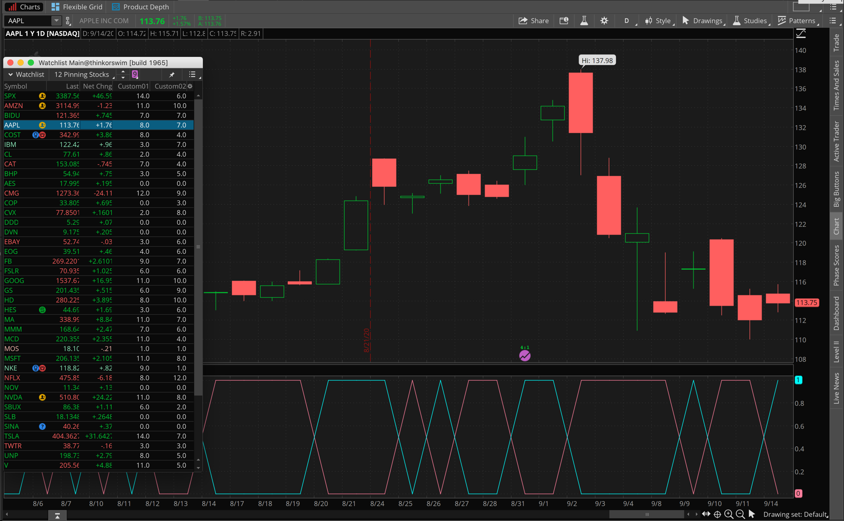
In the comments section we are told that for the previous month the ticker symbol AAPL should display a $1 gain count of 8 and a $1 decline count of 3. However when we build the code according the above specifications we find the computed values are 8 and 7.

Screenshot below shows the results. I have included a lower study on the chart to show exactly when the $1 gain (blue line) and when a $1 decline (red line) is recorded for each bar on the chart within the last month.

Attachments:
Marked as spam
Posted by (Questions: 37, Answers: 4086)
Answered on September 14, 2020 10:56 am
0
Thank you so much Pete! This is what I’m looking for! By the way, the APPL count was just an example I made up to give you an idea of what I’m looking for. Is there a way to add two labels to the chart showing the days for ”$1 Gain” in green and the days for ”$1 Decline” in red?
( at September 14, 2020 11:40 pm)
0
There is, however this was posted in the "Watchlist" topic because that was the original request.
( at September 15, 2020 7:47 am)
0
Darn it! I keep forgetting. I'll request this in the chart section. Sorry Pete!
( at September 15, 2020 8:43 am)