There are no built-in methods to achieve what you described using any user settings or formatting options. The code must be specifically designed to place each of the values at a specified location above or below each candle.
At this time there is no method to do this when the plot style is set to "VALUES_ABOVE" or "VALUES_BELOW". The reason the code for the SequenceCounter study is blocked out and hidden is because developers of Thinkorswim are using code that is not available to the rest of the users of Thinkorswim. It's impossible for us to do the same thing they have done because, for us, "VALUES_ABOVE" are fixed at the high of the candle and "VALUES_BELOW" are fixed at the low of the candle. Thinkorswim developers are able to bend these rules as needed. We don't have that power.
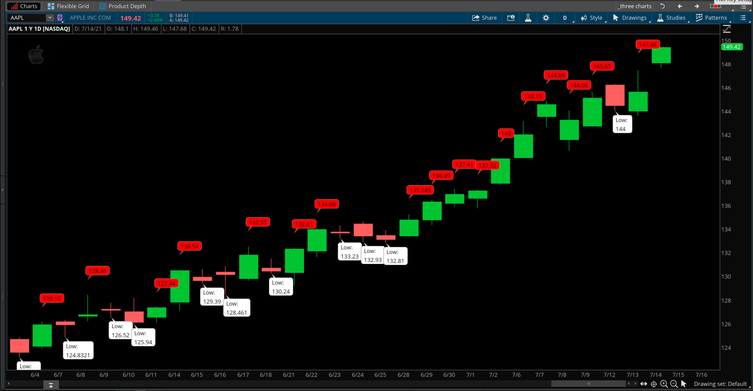
You can work with the AddChartBubble() statements to achieve something similar because that method allows us to set the value it displays independently of the location it appears on the chart.
Using the AddChartBubble() statement we can use the following techniques:
input offsetValue = 1.0;

input offsetLength = 21;

def range = Highest(high, offsetLength) - Lowest(low, offsetLength);

def valueAbove = high;

def valueBelow = low;

AddChartBubble(close > open, high * (1 + offsetValue * 0.01), valueAbove);

AddChartBubble(close < open, low, Concat("Low: n",valueBelow), Color.WHITE, no);
The first AddChartBubble() statement uses the input named "offsetValue" to adjust the verical placement of the chart bubble, offset from the high of the candle based on the range of the highest high and lowest low in the most recent 21 bars.
The second AddChartBubble() statement uses none of those input values and instead uses the special character n (newline) to cause the chart bubble to display multiple lines of values in each bubble.
The screenshot below shows how this code plots on a chart.