| ♥ 1 |
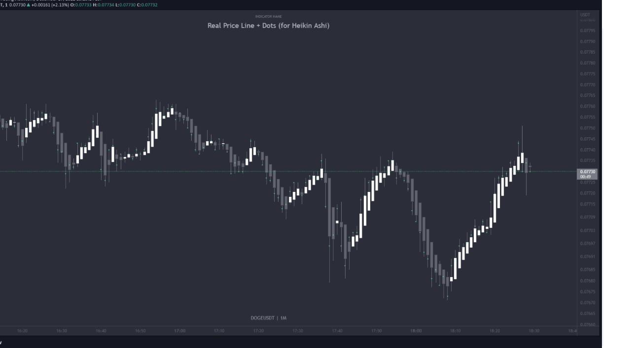
Hello Mr.Pete First of all, thank you so much for incredible work that you do for us its greatly appreciated. I came across with this studies that shows the actual open and high within the Heikin-Ashi candles with colored dots, white dot for the “open” and red dot for the “close” and also have a real price line that moves along with the price movement. Unfortunately this is from “TradingView platform” free open source script that’s not compatible with thinksrips . Is it possible to convert or rewrite this code to make it work on Thinkorswim? I also like to make small adjusments instead of dots I like to use a lines that are similar to dashes (I will attach example picture) and have the option to change the colors of plots and line from the studies menu. I will put code and the link for reference . https://www.tradingview.com/script/iCq7We0z-Real-Price-Line-Dots-for-Heikin-Ashi/ Thank you, Attachments:
Marked as spam
|
|
Private answer
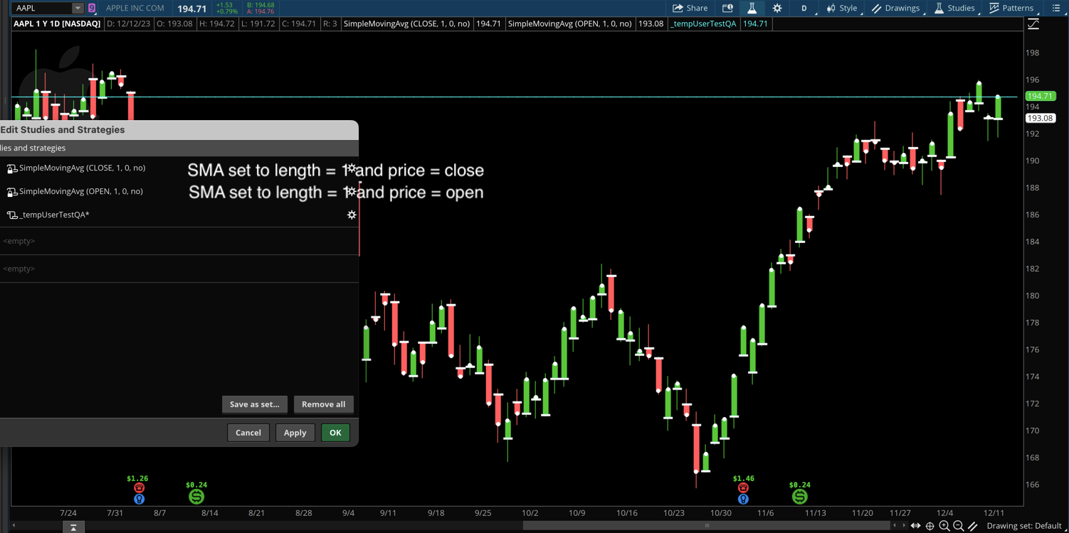
We can do this on Thinkorswim using two standard simple moving averages and two lines of custom script. The screenshot below shows how to add two simple moving averages to the chart. Then you set the length of each average to a value of 1 and set one to the close and the other to the open. Then you can style the plots however you like. In my example I set the close to dots and the open to dashes. (to make it easier to tell them apart). And for the "Real Price Line". We do that will two lines of code added to a new custom chart study:
Attachments:
Marked as spam
Answered on December 12, 2023 4:06 pm
|