Horizontal Lines for Ichimoku


Category:
0
0

Pete,

In regards to the ichimoku indicator, how would you plot the last given value of ‘Span A’ and ‘Span B’?

They’re defined as:

<pre>
def “Span A” = (Tenkan[kijun_period] + Kijun[kijun_period]) / 2;
def “Span B” = (Highest(high[kijun_period], 2 * kijun_period) + Lowest(low[kijun_period], 2 * kijun_period)) / 2;
</pre>

If we plot both of these, we see the cloud lines drawn as their values change in respect to the current price.

What I would like to plot are horizontal lines for the last value that is calculated for each Span. I attached an image with red circles over the end of the ‘Span A’ and ‘Span B’ values. These are the ones I want to plot as lines.

What I was thinking:

<pre>GetValue(“Span A”, GetMaxValueOffset(“Span A”, 1), 0);</pre>

But it isn’t giving me what I want. Any thoughts?

Attachments:
Marked as spam
Posted by (Questions: 1, Answers: 8)
Asked on June 28, 2017 11:31 am
342 views
0

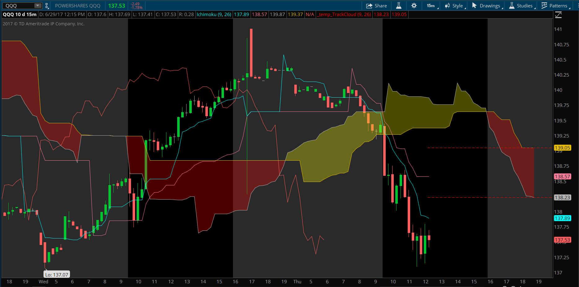
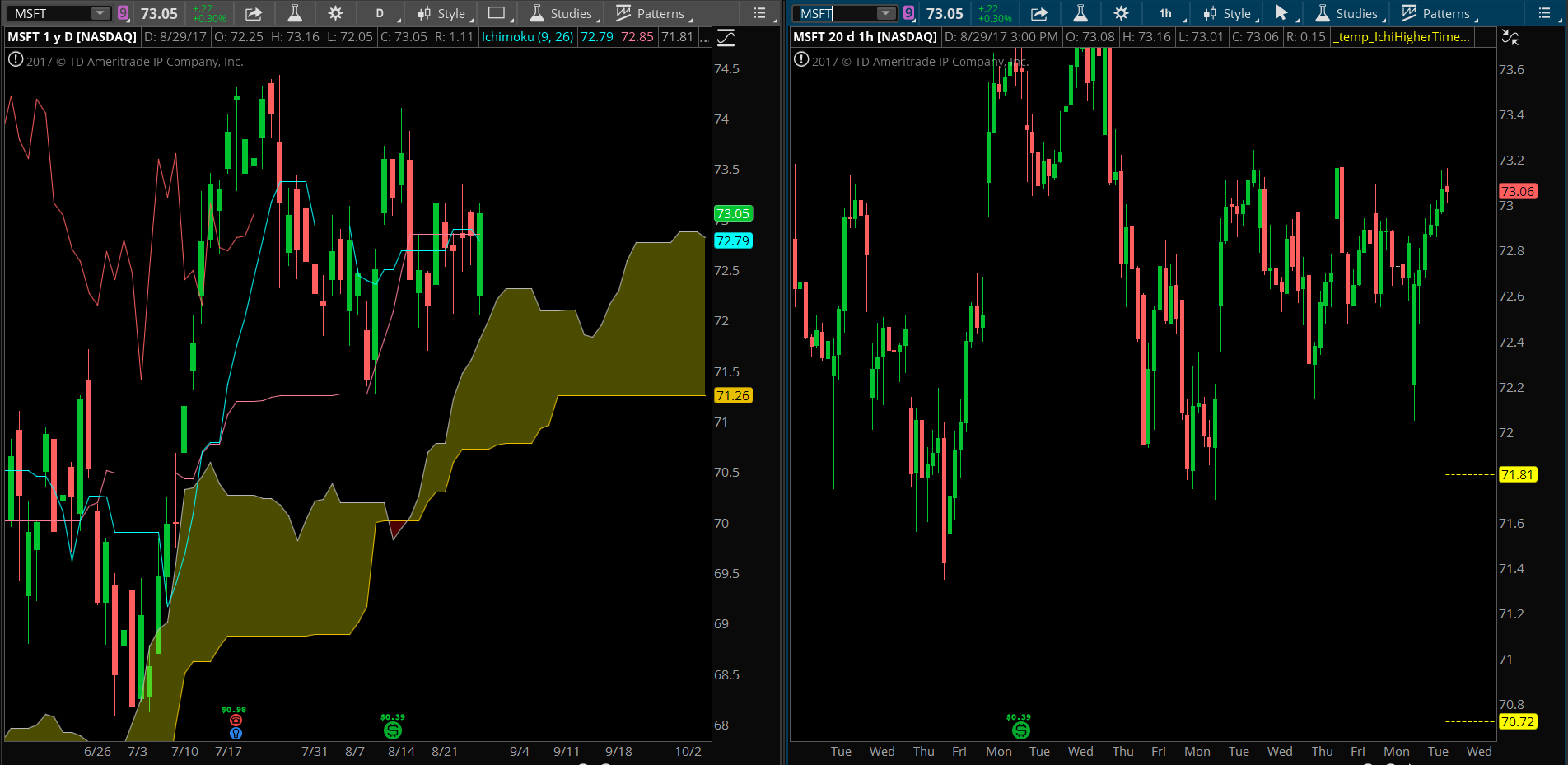
So you say you want horizontal lines plotted across the chart that track the right-most values of Span A and Span B. I am guessing you want those lines to plot to the left, extending into the current price on the chart. Yes? Do you need them to plot any further back then the current price?

( at June 28, 2017 3:25 pm)
0

I’m thinking something like the way the lines are drawn when you use the draw tool to mark a price level. So yea, ideally it would extend all the way to the left. I think we’re talking about the same thing?

( at June 28, 2017 6:25 pm)
0
Private answer

Here is the code that displays the last value of Span A and Span B, extending left, back into the current price action. The horizontal plots are set to change color based on the relative position of Span A and Span B. The colors change to match the default colors of the cloud. Screenshot is attached to show how it displays on the chart. Note, this does not plot the Ichimoku, only the dashed horizontal lines. You will need to add the Ichimoku study to your chart in order to display the cloud and other plots.

Perhaps you can enlighten our viewers as to the meaning of this indicator, how you would use it to make trade decisions.

input tenkan_period = 9;
input kijun_period = 26;
def Tenkan = (Highest(high, tenkan_period) + Lowest(low, tenkan_period)) / 2;
def Kijun = (Highest(high, kijun_period) + Lowest(low, kijun_period)) / 2;
def "Span A" = (Tenkan[kijun_period] + Kijun[kijun_period]) / 2;
def "Span B" = (Highest(high[kijun_period], 2 * kijun_period) + Lowest(low[kijun_period], 2 * kijun_period)) / 2;
rec spanALast = CompoundValue(1, if IsNaN(close[-1]) and !IsNaN(close) then "Span A"[-kijun_period] else spanALast[1], Double.NaN);
rec spanBLast = CompoundValue(1, if IsNaN(close[-1]) and !IsNaN(close) then "Span B"[-kijun_period] else spanBLast[1], Double.NaN);
plot trackSpanA = spanALast;
trackSpanA.SetPaintingStrategy(PaintingStrategy.DASHES);
trackSpanA.AssignValueColor(if spanALast > spanBLast then Color.YELLOW else Color.RED);
plot trackSpanB = spanBLast;
trackSpanB.SetPaintingStrategy(PaintingStrategy.DASHES);
trackSpanB.AssignValueColor(if spanALast > spanBLast then Color.YELLOW else Color.RED);

Attachments:
Marked as spam
Posted by (Questions: 37, Answers: 4087)
Answered on June 29, 2017 9:35 am
0
Private answer

Awesome. This is exactly what I was thinking about. I’ll explain more.

The next step would be to plot lines for multiple ‘Span A’ and ‘Span B’ time frames on a single chart, and then label those plots as their given time frames (The naming would only need to be done once and would never change)

I’ve noticed that by drawing lines myself for the values of the Span’s, I can get a pretty accurate chart for support and resistance. It’s proving itself fairly reliable. I believe that having the ability for them to move as the chart moves will only increase the accuracy of this test. It may also be beneficial to have the lines extend further left as to “see” when the price breaks through it. All the lines you see on the chart are just from plotting the values of the clouds on different time frames. I start with the slowest movers first and work down. Meaning… Plotting lines for the Week cloud values, the day values, the 4 hour values, the hour values, and the 30 minute values. As we continue down, the values change almost too frequently for me to chart them. (Hence the reason for wanting something that does it for you automatically.

Here’s how I used it this morning on an SPX PUT.

At market open, your indicator signaled a breakout spike (Doing exactly what it’s written to do) that failed to cross above the cloud. Heading downward, it finds support at 6:45am right along the 30 minute Span B cloud value  of 2433.06 (Labeled as 30M Btttm) From here it pulls back off it’s low to find resistance at 6:50am up at the Hourly Span A cloud valued at 2436.42 (Labeled as Hr Top). On the 5 minute chart, this is also very close to it’s time current cloud. Your indicator issues a bear breakout w/o confirmation at this point.

Going back to the minute chart, we see that it rides this new resistance trend until 6:59am at which point it turns south and does not break through. This is roughly where I entered the trade. Heading south, SPX touches the 4 hour Span A cloud valued at 2434 and bounces off of it, but only just slightly. It’s not even enough to take it back to the Hr Top cloud (2436.42). It then breaks through both the 30M Bttm plot and the Hr Bttm plot at 7:05am. It bounces again, but does not cross through the 4Hr cloud value it broke before.

Then around 7:16am it crosses below the Daily Top and the 30M Top (2430.28 and 2429.31, respectively). This is where I sell because the price touches the 15 minute chart cloud and I’m a chicken.

Hopefully this walk through will help other readers see what I’m seeing with the benefit of the cloud values. If anyone has questions or wants further explanation I’m happy to answer the best I can.

Attachments:
Marked as spam
Posted by (Questions: 1, Answers: 8)
Answered on June 29, 2017 12:30 pm
0

Very interesting. Thank you for explaining this is such detail. I look forward to hearing from other viewers how their experience with the concept impacts their trades. Perhaps I will develop this into a new MTF indicator. I would need to sell it as a premium study in order to cover development costs. But the price should be very reasonable.

Consider some of these details and let me know how you practice this methodology. At the moment, you are manually drawing these lines. I imagine the weekly lines are drawn based on Friday’s close, and you would update those lines on Monday, when the new week opens. Lines based on the daily chart would be taken from the previous day’s close and updated each morning before the open. Is this how you are applying the lines? Because that impacts how the code is written.

And if that description of weekly and daily lines is accurate. You would then be updating the 4 hour lines every 4 hours. And the 1 hour line every hour. And so on. The idea being that we are always looking at the levels from the most recently close candle. I can’t imagine these would have any value if they were being updated in real time on the current higher time frame bars. Because you would then have a moving target. And backtesting would become impossible. Historic price action at those levels would produce no usable data. Which is a concern I have viewing your charts and reading your description of price reacting to these levels.

( at June 29, 2017 2:08 pm)
0
Private answer

Currently I’ve been drawing the lines in the morning before the open. I see what you’re saying about the values changing, and in my experience, the slower values changes throughout the day are negligible as they are less volatile.

However, I’ve been attempting to collect some data on the value changes regardless of how slight and see what impact it has on those “resistance/support” lines.

What kind of price would we be talking to develop this out further? As mentioned earlier, there really isn’t a way to back test it. Real time results would be the only way to know for sure. It’s very possible that it might not even work. At this point I’m not sure.

Is it a requirement for Aggregation periods to have a set point of data to look at to plot? (Open, high, close, etc.) Or is it possible to use Multi Time Frame charting to update as price moves?

Thanks for all your help and answering these questions. I appreciate it.

Marked as spam
Posted by (Questions: 1, Answers: 8)
Answered on July 31, 2017 10:33 am
0

I’ll add this to my to-do list so that I’m reminded to consider working this out at some point in the future. Would be great to get some feedback from other viewers before spending too much time on it.
My view is that for true support/resistance, those levels need to have a fixed value for a fixed period. Moving targets are not support/resistance.

( at July 31, 2017 1:02 pm)
0

Hey Pete. Just checking back in as an update. I hate that no one else has commented on this thread.

I’d still like to get this up and running with the multiple plot values, but I know that it can’t be a top priority of yours since theres a large chance it may not even be useful as a tool.

I was wondering if there’s a way you could point me in the direction of how I might write this myself. From my understanding, the same with the MTF MACD you use, we can’t plot a secondary agg that’s less than the primary aggregation.

So if we’re looking at the 1min chart and wanted to plot the value of Span A from the 1hour chart, we would need to have a pointer that stays on the last value of the 1hr SpanA, and then plot the value of that pointer. Am I on the right track with this?

Also, are you using the compound value for ‘rec’ because it’s a moving calculation?

( at August 29, 2017 1:18 pm)
0
Private answer

In response to additional request posted in the comments section on 8/29/17 by AquaticNomad.

Here is the same code I posted originally which has been modified to plot the same levels from the daily time frame. The screenshot I include below shows the indicator plotted on the right side chart, which is set to Hourly. The chart on the left is set to Daily.

This will show you how to plot the Span A and Span B  value from a higher time frame.

Editors note: Two statements originally posted in the code below contained an error. def "Span A" and def "Span B". They have been corrected.

input tenkan_period = 9;
input kijun_period = 26;
input higherTimeFrame = AggregationPeriod.DAY;
def Tenkan = (Highest(high(period = higherTimeFrame), tenkan_period) + Lowest(low(period = higherTimeFrame), tenkan_period)) / 2;
def Kijun = (Highest(high(period = higherTimeFrame), kijun_period) + Lowest(low(period = higherTimeFrame), kijun_period)) / 2;
def "Span A" = (Tenkan[0] + Kijun[0]) / 2;
def "Span B" = (Highest(high(period = higherTimeFrame)[0], 2 * kijun_period) + Lowest(low(period = higherTimeFrame)[0], 2 * kijun_period)) / 2;
rec spanALast = CompoundValue(1, if IsNaN(close[-1]) and !IsNaN(close) then "Span A"[-kijun_period] else spanALast[1], Double.NaN);
rec spanBLast = CompoundValue(1, if IsNaN(close[-1]) and !IsNaN(close) then "Span B"[-kijun_period] else spanBLast[1], Double.NaN);
plot trackSpanA = spanALast;
trackSpanA.SetPaintingStrategy(PaintingStrategy.DASHES);
trackSpanA.AssignValueColor(if spanALast > spanBLast then Color.YELLOW else Color.RED);
plot trackSpanB = spanBLast;
trackSpanB.SetPaintingStrategy(PaintingStrategy.DASHES);
trackSpanB.AssignValueColor(if spanALast > spanBLast then Color.YELLOW else Color.RED);

Attachments:
Marked as spam
Posted by (Questions: 37, Answers: 4087)
Answered on August 29, 2017 4:03 pm
0

Pete,

Really appreciate the response. Code seems pretty straightforward, but I can’t figure out why the numbers aren’t lining up. The day chart in your attachment has values of 72.79 and 71.26 whereas the hourly chart with the daily plots shows the values as 71.81 and 70.82.

I tried playing with aftermarket extensions to see if that was causing it, but to no avail. Is there something not being accounted for?

( at August 30, 2017 4:54 pm)
0

Oops, sorry. Span A and Span B for the higher time frames, need to be shifted so that the end values are at the current bar, instead of 26 bars to the right. Here are those two statements, with the kijun_period inputs being replaced with a value of zero:
def “Span A” = (Tenkan[0] + Kijun[0]) / 2;
def “Span B” = (Highest(high(period = higherTimeFrame)[0], 2 * kijun_period) + Lowest(low(period = higherTimeFrame)[0], 2 * kijun_period)) / 2;

I will make the correction in the answer I posted so future visitors are not confused.

( at August 30, 2017 5:20 pm)
0

As I’m entering this, I’m noticing that it won’t plot any of the frames except a weekly if my main chart is on a time higher than 5min.

I thought that as long as the secondary aggregation was under the current chart, it’s ok?

( at August 30, 2017 6:12 pm)
0

The secondary aggregation should be above (higher), not under, the current chart time frame. Keep in mind there are limits to the amount of data available to a 5 min chart. Something like 15 days. And you need far more data than that to plot a weekly Ichimoku. TradeStation could handle this without trouble. But not Thinkorswim.

( at August 30, 2017 6:19 pm)
0

Oh. Ok. That makes sense.

Is there a way to label the plots on the chart so I can see which ones are coming up and which ones aren’t?

( at August 30, 2017 7:23 pm)
0

Rather than apply labels (they tend to clutter the chart) I suggest you employ a simple color scheme to keep track of various time frames. You can even change the plot style (from solid to dashed, or even dots)

( at August 30, 2017 7:48 pm)
0
Private answer

Taking what you gave me, it was pretty straightforward to put it all together. I made a completely new study to remove clutter. Since Tinkan and Kijun’s are defined in each set, it seemed like it would be ok to do it this way.

<pre>

input tenkan_period = 9;
input kijun_period = 26;

#THIRTY MINUTE LINES

def tenkanthirty = (Highest(high(period = AggregationPeriod.THIRTY_MIN), tenkan_period) + Lowest(low(period = AggregationPeriod.THIRTY_MIN), tenkan_period)) / 2;
def kijunthirty = (Highest(high(period = AggregationPeriod.THIRTY_MIN), kijun_period) + Lowest(low(period = AggregationPeriod.THIRTY_MIN), kijun_period)) / 2;
def “Span AThirty” = (tenkanthirty[0] + kijunthirty[0]) / 2;
def “Span BThirty” = (Highest(high(period = AggregationPeriod.THIRTY_MIN)[0], 2 * kijun_period) + Lowest(low(period = AggregationPeriod.THIRTY_MIN)[0], 2 * kijun_period)) / 2;

rec spanALastThirty = CompoundValue(1, if IsNaN(close[-1]) and !IsNaN(close) then “Span AThirty”[-kijun_period] else spanALastThirty[1], Double.NaN);
rec spanBLastThirty = CompoundValue(1, if IsNaN(close[-1]) and !IsNaN(close) then “Span BThirty”[-kijun_period] else spanBLastThirty[1], Double.NaN);
plot trackSpanAThirty = spanALastThirty;
trackSpanAThirty.SetPaintingStrategy(PaintingStrategy.DASHES);
trackSpanAThirty.AssignValueColor(if spanALastThirty > spanBLastThirty then Color.YELLOW else Color.RED);
plot trackSpanBThirty = spanBLastThirty;
trackSpanBThirty.SetPaintingStrategy(PaintingStrategy.DASHES);
trackSpanBThirty.AssignValueColor(if spanALastThirty > spanBLastThirty then Color.YELLOW else Color.RED);

#ONE HOUR LINES

def tenkanonehour = (Highest(high(period = AggregationPeriod.HOUR), tenkan_period) + Lowest(low(period = AggregationPeriod.HOUR), tenkan_period)) / 2;
def kijunonehour = (Highest(high(period = AggregationPeriod.HOUR), kijun_period) + Lowest(low(period = AggregationPeriod.HOUR), kijun_period)) / 2;
def “Span AOnehour” = (tenkanonehour[0] + kijunonehour[0]) / 2;
def “Span BOnehour” = (Highest(high(period = AggregationPeriod.HOUR)[0], 2 * kijun_period) + Lowest(low(period = AggregationPeriod.HOUR)[0], 2 * kijun_period)) / 2;

rec spanALastOnehour = CompoundValue(1, if IsNaN(close[-1]) and !IsNaN(close) then “Span AOnehour”[-kijun_period] else spanALastOnehour[1], Double.NaN);
rec spanBLastOnehour = CompoundValue(1, if IsNaN(close[-1]) and !IsNaN(close) then “Span BOnehour”[-kijun_period] else spanBLastOnehour[1], Double.NaN);
plot trackSpanAOnehour = spanALastOnehour;
trackSpanAOnehour.SetPaintingStrategy(PaintingStrategy.DASHES);
trackSpanAOnehour.AssignValueColor(if spanALastOnehour > spanBLastOnehour then Color.YELLOW else Color.RED);
plot trackSpanBOnehour = spanBLastOnehour;
trackSpanBOnehour.SetPaintingStrategy(PaintingStrategy.DASHES);
trackSpanBOnehour.AssignValueColor(if spanALastOnehour > spanBLastOnehour then Color.YELLOW else Color.RED);

</pre>

Marked as spam
Posted by (Questions: 1, Answers: 8)
Answered on August 30, 2017 7:41 pm
0

Keep messing up the code wrapping. Can’t seem to get the edit page to load.

Also… I think Agg periods are built in functions for TOS so I just used them directly instead of referencing other inputs.

( at August 30, 2017 7:44 pm)
0

yeah, when I post code in the answer box I wrap them in tags using the text editor: <code></code> (you have two buttons at the top, Visual and Text. I switch to Text view, add the code and wrap the entire section of code in the tags.

( at August 30, 2017 7:51 pm)