| ♥ 0 |
Hey, I’ve been poking around everywhere to find a relatively simple indicator based on percentage change, but can’t find it. Is there an easy way to have an indicator on lower study that will show the relative strength of a ticker by percent change? Like if my base ticker (index, stock, etc…user defined) moves up 1% one day and my comparative ticker moves up 2% that day, the line goes up 1. The next day, may be the same thing. Third day both are up 1% (no outperform or underperform), so the line stays flat. And then, secondly, apply this to a watchlist column with a beginning date so at a glance you can see how the tickers on the watchlist have out performed or underperformed percentage wise the base ticker over the last 10 or 30 days (again, user defined)? Thanks!!!
Marked as spam
Asked on October 30, 2018 6:31 am
378 views
|
|
Private answer
This is a very similar idea to one we have already published. The concept of having a start date from which the relative strength can be computed. Which facilitates the ability to run scans that match what you see on the chart. You can get details here: https://www.hahn-tech.com/thinkorswim-scan-relative-strength/ So we have a request for a chart study and a custom watchlist column. The code is very much the same for each. The only thing I will add is to change the background color based on values above or below zero. Here is the code for the chart study:
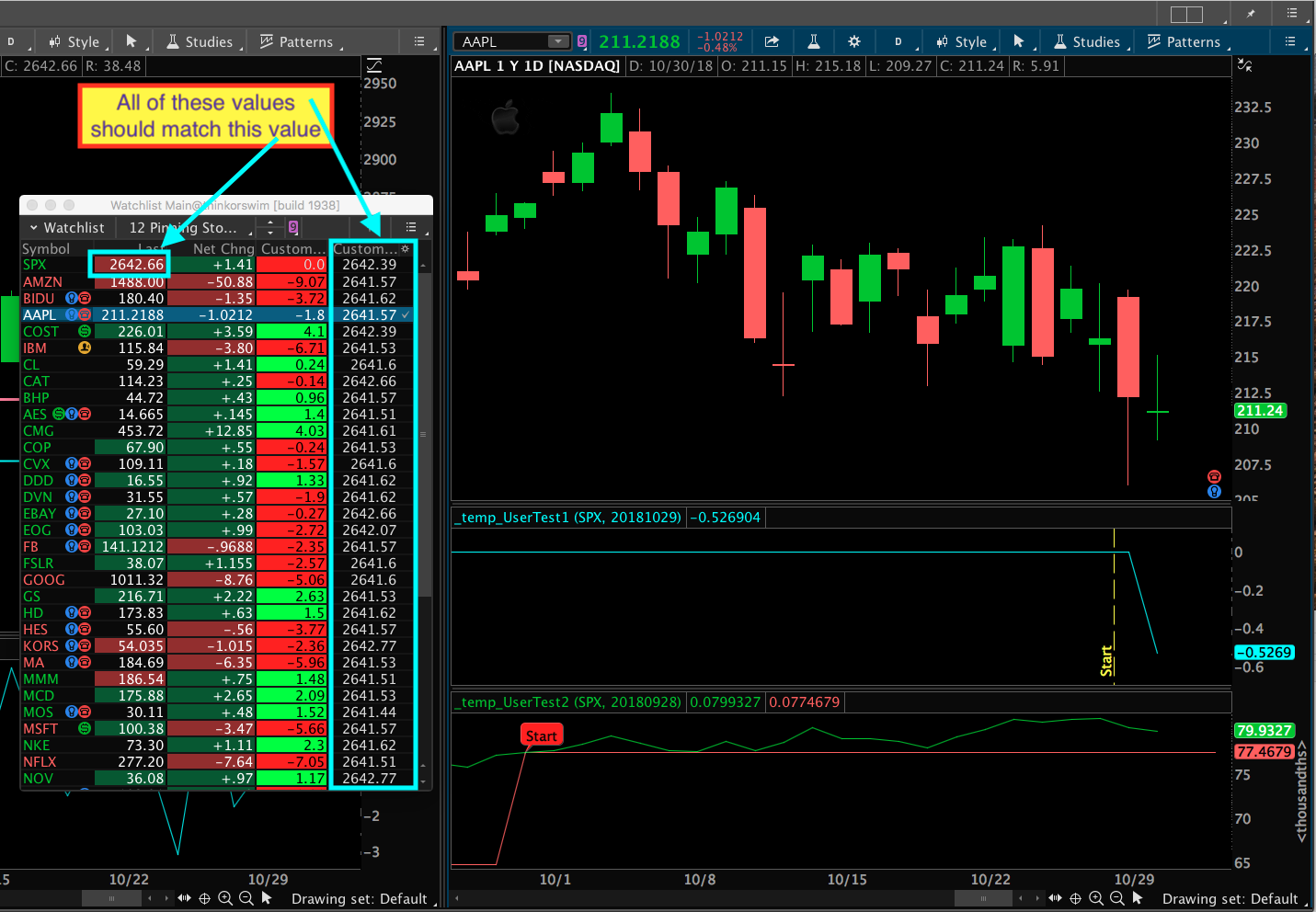
IMPORTANT NOTE ABOUT PUTTING THIS INTO A WATCHLIST The values do not compute correctly. Some tickers are close but others are way off. I spent way too much time digging into the details. Screenshot below includes some comments to show just one of the many glitches. I am afraid that Watchlists on Thinkorswim are severely broken. Someone else is going to have to report it because I just don’t have time. I’ll post the code anyway just in case at some point in the future they fix whatever problem they have. (an ambitious viewer might just take both of these code sections and submit them to TDA support asking them to fix their problem….) Here is the code for the watchlist:
Attachments:
Marked as spam
Answered on October 30, 2018 11:01 am
|