| ♥ 0 |
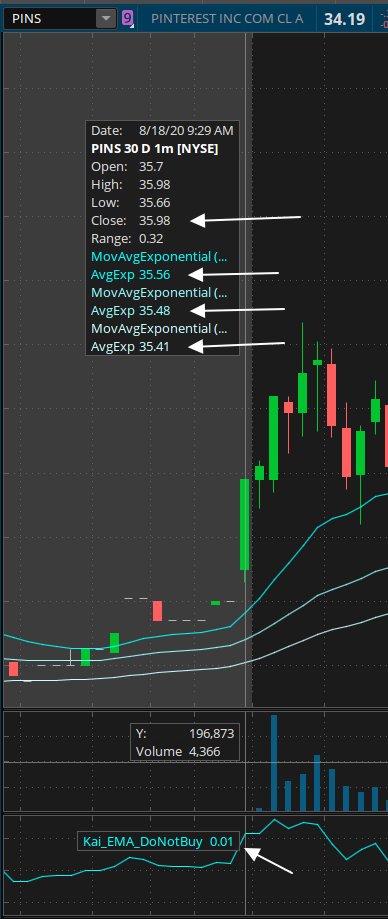
Hi, I’m need to compare the close against three different Exponential Moving Averages (EMA) to alert me of a buying or selling opportunity. For example, I have the following: Close: 35.98 I find the difference between the close and the EMAs, then divide against the close. My idea here is to get a common value for me to script, regardless of the price of the stock. TSLA $2000+ vs PINS $38, for example. Close: 35.98 However when I plot it in the charts, the values shown is rounded to two decimal places. Is there a way to have the charts display up to 4 decimal points (or more)? Also, in ThinkScript, do I have to define the decimal points to have the script calculate on? My concern is that if not defined, my script will do the following: (Close – EMA20)/Close – (Close – EMA50)/Close = 0.00 instead of (Close – EMA20)/Close – (Close – EMA50)/Close = 0.0022 Please advise! PINS Attachments:
Marked as spam
Asked on August 23, 2020 3:58 am
478 views
|
|
Private answer
There are no settings currently available to change the display properties for values on the charts of Thinkorswim. In regards to your concern about the values being rounded from 0.0022 to 0.00 and therefore throwing off your comparisons for greater than or less than. We only need to go back to your previous post to confirm the code indeed uses the full decimal precision for all elements even though only 2 decimal places are displayed on the charts. So the difference is merely aesthetic. The code uses the full decimal precision available from the "double" data type regardless what the chart is allowed to display. https://www.hahn-tech.com/ans/need-help-with-shooting-star-in-condition-wizard/ That previous post also shows one of the only tricks I have found so far that can force portions of the platform to display more decimal points. It's possible that trick only works for lower chart studies where it is very common to see decimal precision out to several digits. Have you tried applying that trick to code applied to the upper price graph? Marked as spam
Answered on August 23, 2020 8:37 am
|