| ♥ 0 |
Hello, I am new to trading and have been following your youtube channel and studies to learn and doing paper trading. I have a quick question on the “OnBalanceVolume” study in the TOS platform.
I am plotting the value of this study as OnBalanceVolume().OBV on a label as below. AddLabel(yes,”OBV: ” + OnBalanceVolume().OBV, Color.LighT_GRAY);
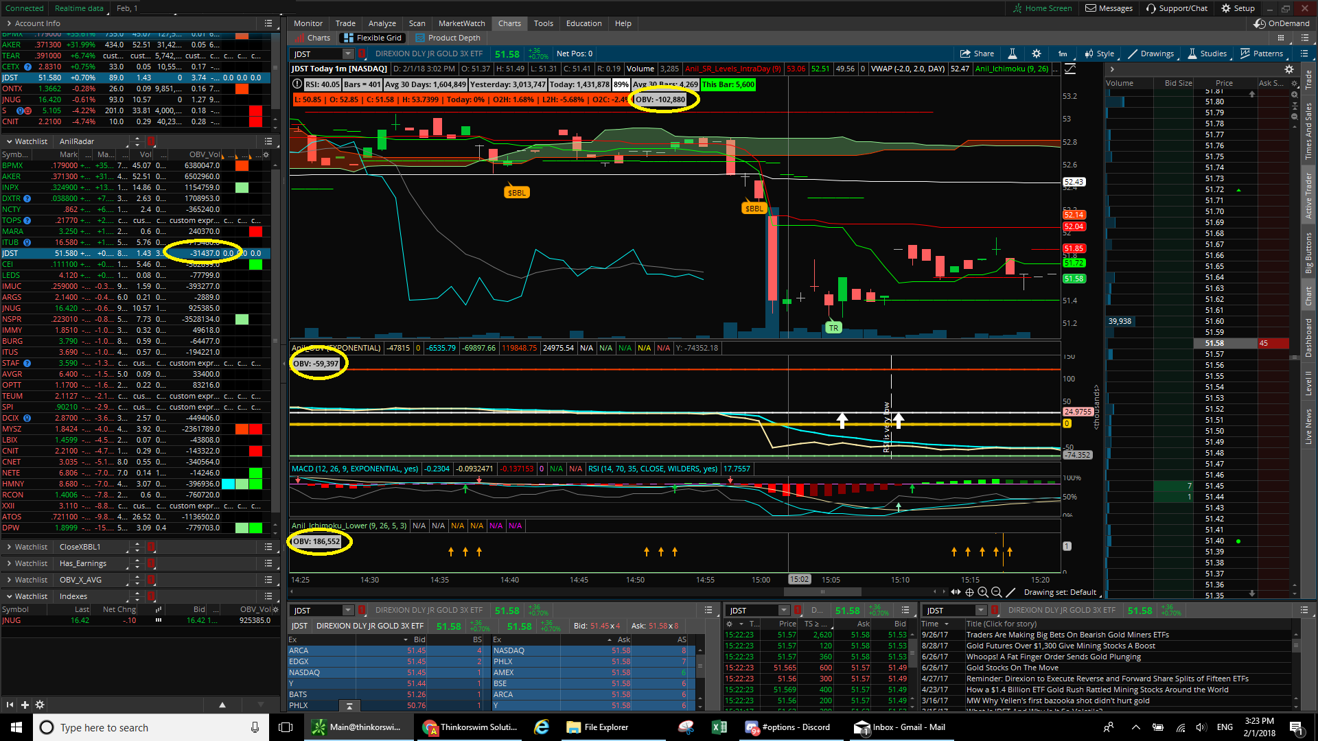
Question is: This label does not show the same value on Custom Quote, Chart, Lower Study1 and Lower Study for the same symbol. Its confusing and I dont know which is correct value. I do not know what I am missing here. Could you please help. I have attached the snapshot for reference.
Appreciate your help! Attachments:
Marked as spam
Asked on February 1, 2018 1:27 pm
167 views
|
|
Private answer
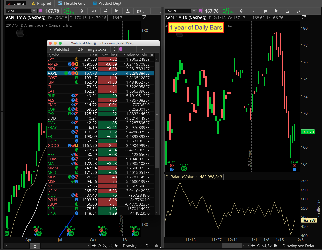
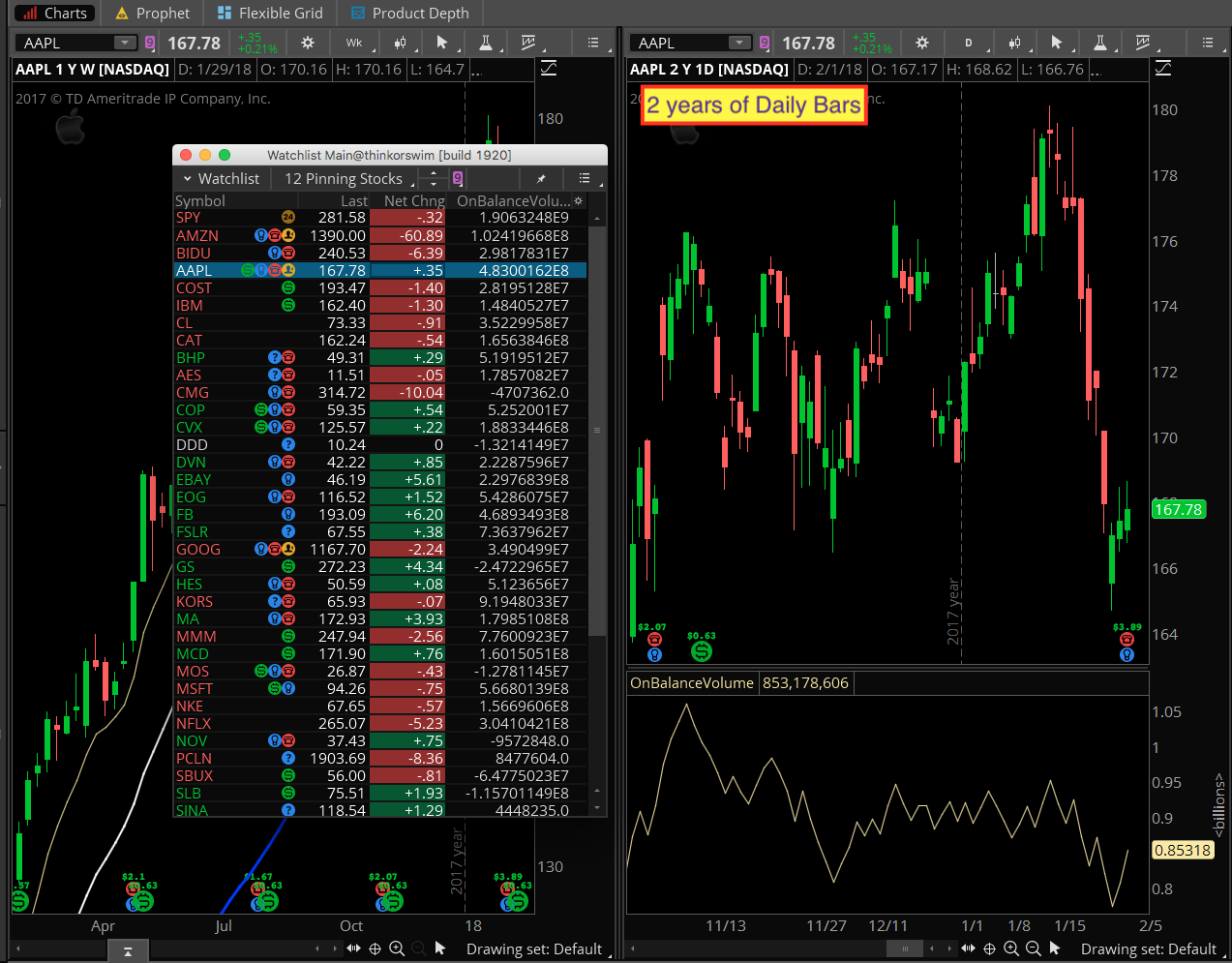
I can tell you that you should expect to see different values between any watchlist and a chart using the same aggregation periods. Why? Because this study uses a function called TotalSum(), which accumulates a total based on how many bars are available to the study. Hang in there, it will make sense in a second. So we have different lengths of time available based on which aggregation period is selected. But even if you set the watchlist and the chart to the same exact aggregation period, you have to account for the number of bars available to the code running in the watchlist. You can get those details here: http://toslc.thinkorswim.com/center/howToTos/thinkManual/Scan/Stock-Hacker/studyfilters.html Even armed with this information you may it’s not possible to set the time span of the chart to match the number of bars being used in the watchlist. **Good luck. To help make the point a bit more clear I have attached a couple of screenshots below. Each one shows a watchlist with the OBV added as the far right column. It is place to the left of a daily chart of AAPL. Notice that AAPL is the selected item in the watchlist to help you spot the value more easily. Notice in the first screenshot we have 1 year of daily bars. And the values match perfectly. But what happens when we add more data to the chart? Notice the second screenshot is set to 2 years of daily bars. The values are not even close. **I should also mention something else, for the benefit of the rest of our viewers. For this type of indicator, the current value is completely meaningless. The only way to make use of this indicator is to plot the entire line and identify patterns (divergence or ?). Simply plotting the current value in the upper left corner of the chart is completely and utterly useless. (sorry, I really do have to be that blunt to protect the rest of our viewers). The same goes for adding this to a watchlist. No value whatsoever. Attachments:
Marked as spam
Answered on February 1, 2018 4:26 pm
|