| ♥ 0 |
I am looking to add a label on the charts which shows 5/21 EMA crossover (would like to add multiple labels for different time frames to view the 5/21 EMA crossover (or any other EMA crossover)). Example, If I am viewing the 1 min chart I want to be able to see labels for other time frames i.e. 15 min, 30 min, 1 hour, 4 hour, Daily, Weekly, Monthly. The labels should indicate a number for which time frame it is for. Example if the label is for the 30 min time frame than the label should read “30”. The label should be differentiated by two different colors. The label should be one color for a positive EMA crossover and another color for a negative EMA crossover. Thank you for your help Pete.
Marked as spam
Asked on July 17, 2018 8:21 am
1087 views
|
|
Private answer
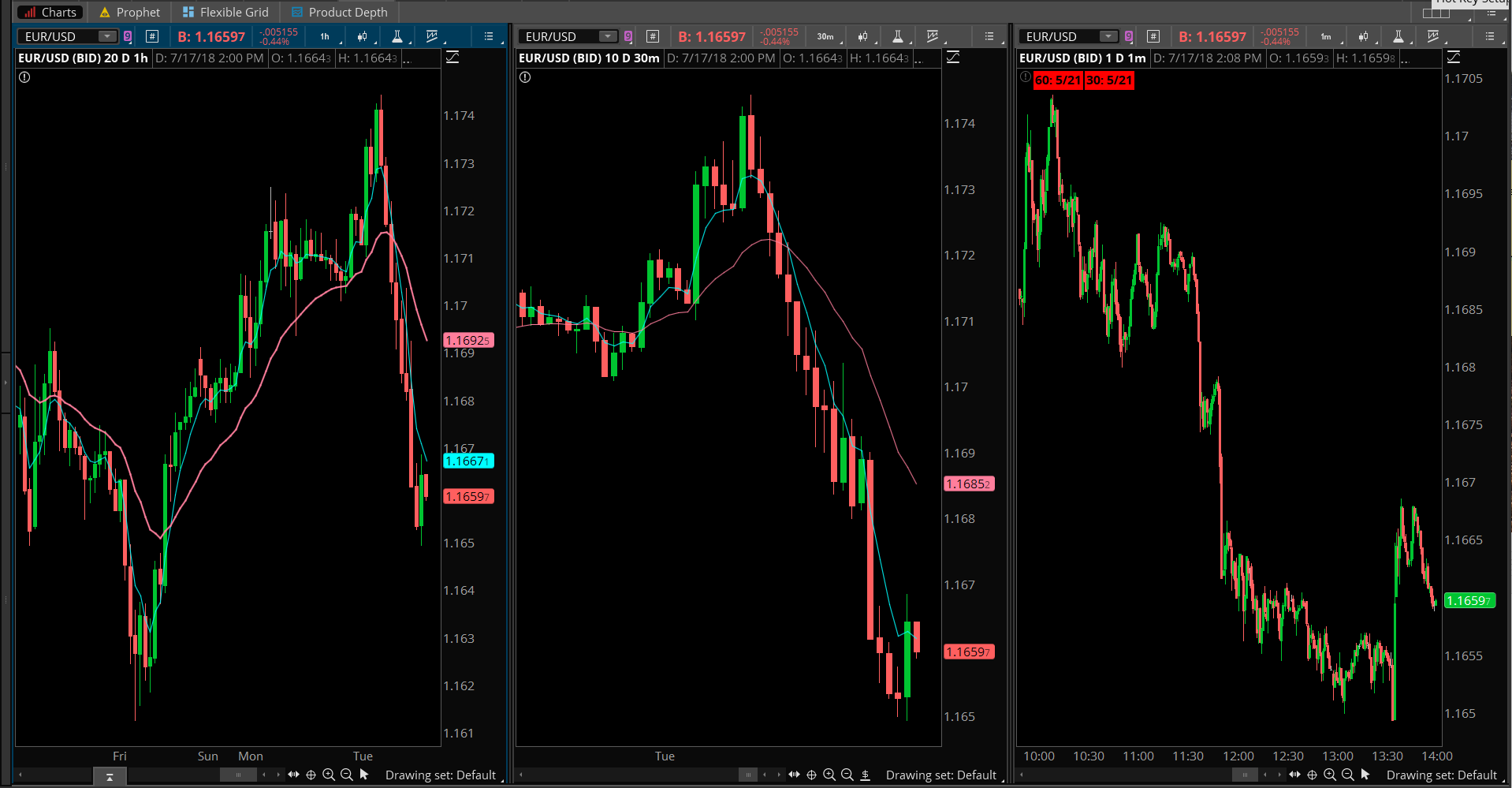
Let’s cover a few items before we get into the solution. Time FramesThere will be limits to how high a time frame you can add to a one minute chart. The amount of historical data displayed on the 1 min chart will directly impact the ability to plot higher time frames. Consider the monthly time frame as an example. You are using Exponential Moving Averages. The longest ema is 21 periods. The 21 ema will require 84 months of historical data in order to accurately display the monthly time frame. Read more details here if you are scratching your head wondering where the 84 figure came from: https://www.hahn-tech.com/moving-averages-exponential-problems/ The same figure applies to all time frames you might try to apply on the 1 min chart. You will need 84 weeks of data for the weekly time frame. You will need 84 days of data for the daily time frame. The 4 hour bar is likely impossible for most applications too. Unless you are working with Forex. This leaves the 2 hour time frame as being the maximum supported for the 1 min chart. Crossover or Relative PositionYou describe it as a crossover. But you only provide two colors. Red for cross above and green for cross below. Since a crossover is an event that appears very rarely on the chart, we have a contradiction. What color to set when no crossover is presently taking place? Since you have provided only two color options, I will interpret your request to mean that you actually want to capture the relative position of each moving average. Not the crossover events. So if 5 ema is above 21 ema, color green. If 5 ema below 21 ema, color red. The SolutionHere I will present the code to display 2 of these labels on a chart. You can replicate these lines of code as many times as needed. Just be sure to notice the variable names must be unique. So I append each variable name with, One, Two, Three… etc for each successive time frame. Here is the full list of supported time frames: http://toslc.thinkorswim.com/center/reference/thinkScript/Constants/AggregationPeriod.html (the nested Concat() statements that form the label’s text is going to be very intimidating for most. Just make sure when you replicate those that you change the number appended to the end, One, Two, Three… etc)
Screenshot below shows the result Attachments:
Marked as spam
Answered on July 17, 2018 11:15 am
|
|
|
Private answer
Try this code in the attached .txt document. MTF labels should not be limited by the amount of data when adding it to the One_Min chart now. There are too many characters in the code to allow me to post the code directly in this comment box. Marked as spam
Answered on July 27, 2020 7:59 am
|