| ♥ 0 |
I can get the candles to match two of the four colors. Can anyone assist to make it all match? Here’s the link to my semi-custom indicator [REMOVED BY MODERATOR]
Marked as spam
Asked on January 5, 2018 1:57 am
1565 views
|
|
Private answer
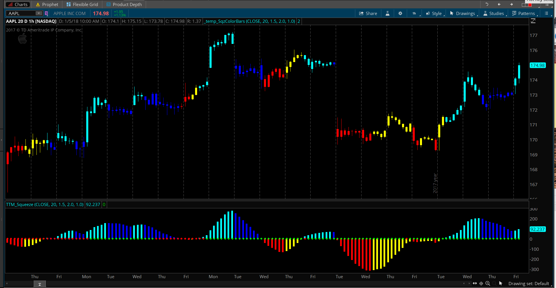
The link to your shared custom indicator has been removed. The code in that custom indicator does not comply with our Terms and Conditions. I am going to do the best I can to respond to your question, assuming you had no idea what was in that indicator which breached our terms and conditions. In providing a solution to your request, I am going to refer to some code we published for coloring the background of a watchlist based on TTM Squeeze: Thinkorswim TTM Squeeze Watchlist Histogram You can view the original code at the link provided to the video. Here is the modified code that will color the chart candles the same as the colors of the histogram of the TTM Squeeze. Since the TTM Squeeze is already a built-in study, we can do this without exposing the proprietary source code.
In order to adapt this code only a single change was required. Can you spot it? The word AssignBackgroundColor was changed to AssignPriceColor. That’s it. Attached screenshot shows the result. Attachments:
Marked as spam
Answered on January 5, 2018 8:57 am
|
|||||
|
Private answer
My apologies for breaking the terms and conditions rules. No excuse. I do thank you for the additional code. I will test this now. Hopefully I can figure this out. Marked as spam
Answered on January 5, 2018 9:40 am
|
|||||
|
Private answer
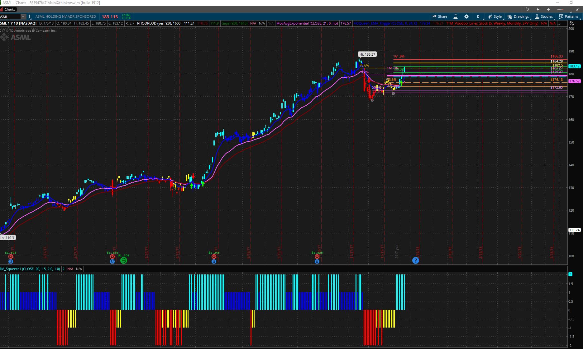
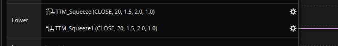
Was this added somehow to the one in question? Or created a new one? If added, can you assist in that? If created new, I get this look (attached) on my squeeze line. You can see the name with a 1 at the end. To fix this, I created a new one and hid the study from the chart and only showed the original. Is this what was done? Thanks for the help! Attachments:
Marked as spam
Answered on January 5, 2018 12:22 pm
|
|||||
|
Private answer
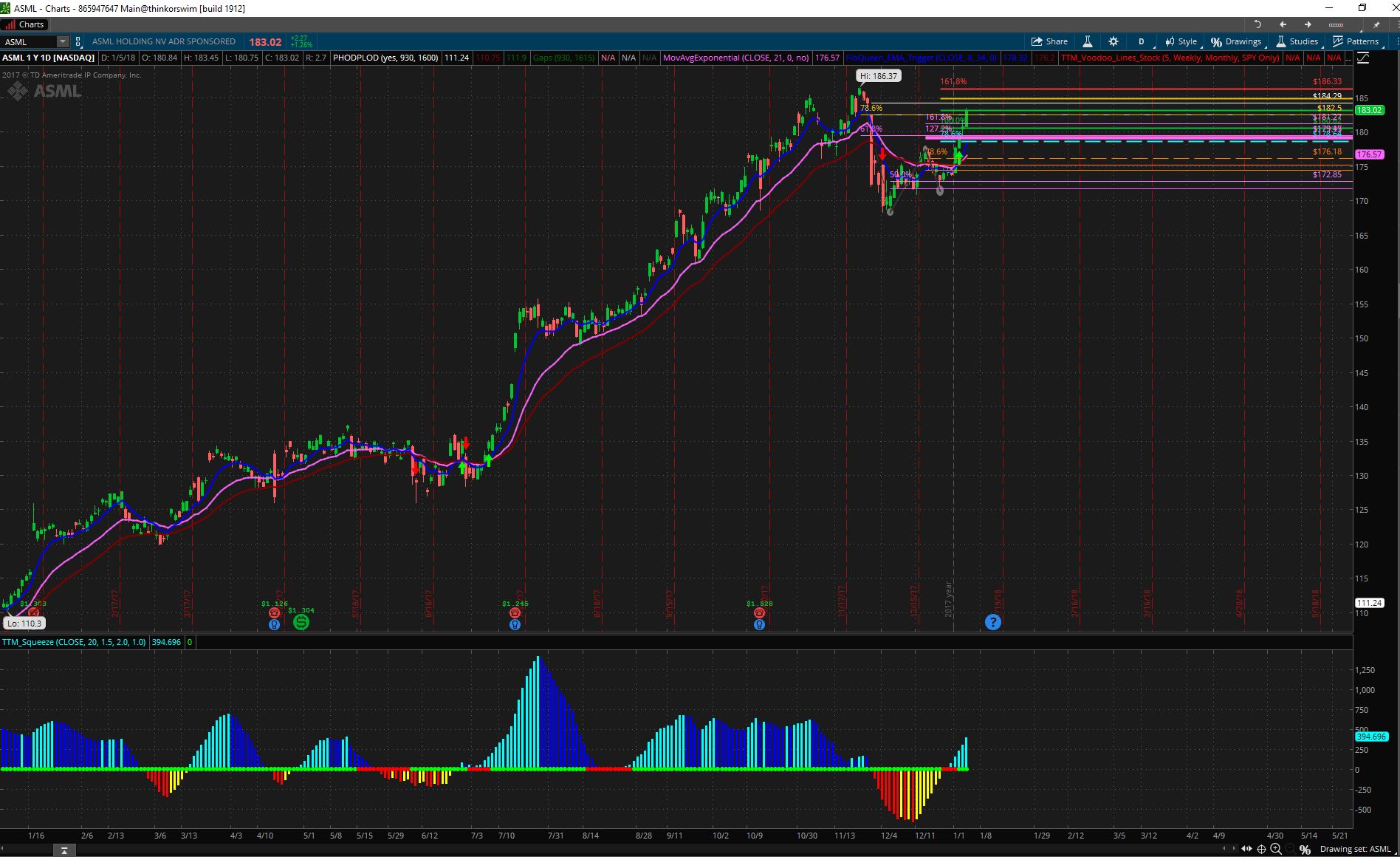
I meant the settings like this. Just realized, when I hid the study the colors change. So I set it up like this if correct? Attachments:
Marked as spam
Answered on January 5, 2018 12:24 pm
|