Modify Chart label wording based on daily ATR


Category:
0
0

Hello Pete,


I hope all is well. The purpose of this study is to modify the current code below that plots the daily ATR on the 1-minute chart and shows a color based on if the range is tight (yellow), normal (green) or wide (red).


All I would like is instead of the code showing the value and color, please only show the word and color “tight, normal, and wide”


input length2 = 14;
input ATRaverageType = AverageType.WILDERS;

def dailyHigh = high(period = “DAY”);
def dailyLow = low(period = “DAY”);
def dailyClose = close(period = “DAY”);

plot ATR = Round(MovingAverage(ATRaverageType, TrueRange(dailyHigh, dailyClose, dailyLow), length2));
AddLabel(yes, “Range: “+ATR, if ATR > 0.24 then Color.green else if ATR > 0.70 then Color.green else Color.yellow);

#if yellow label tight, if red label wide, if green label normal

Marked as spam
Posted by (Questions: 22, Answers: 63)
Asked on July 20, 2019 2:28 am
559 views
0
The statement that creates the label in your example code does not have a setting for red. It only provides settings for green or yellow. That label is never red.
( at July 20, 2019 10:05 am)
0
Sorry about that, can you please add that settling also, the range should be if ATR > 0.50 then Color.red else if ATR > 0.24 then Color.green else Color.yellow); yellow = tight range = less than .24 green = normal range = between .25 and .69 red= wide range= greater than .75
( at July 20, 2019 12:06 pm)
0

You still have a discrepancy there in your last comment. First you state that if ATR > 0.50 then color RED. Later on you state that RED equals wide range and is greater than 0.75. So which is it? Your specifications and code are all over the board here and I am completely lost.

Also, please make sure you realize the ATR is dependent on the price of the stock being plotted. So these values you are specifying here will not be applicable for a wide variety of stocks. If you want something more realistic, you should be specifying these are percentage values. For example a value of today's ATR being greater than the 14 period ATR times 120. Now THAT is a wide range. These numerical values you have here are meaningless.

In your history on this forum, you seem to have a knack for specifying things that are locked into a very narrow application. This forum reaches a vast audience and the only reason I spend time here is to benefit ALL of that audience. Your participation here is important to this forum. So in the future, please be considerate of the rest of our audience and make sure your specifications can be applied to a wide range of stocks and not just the handful of stocks you are focused on.

( at July 20, 2019 3:43 pm)
0
The study will be used on the intraday chart to show stocks daily ATR range so it will be pulling data from the daily chart, no different as if a trader had the 14 day daily ATR on their watchlist. (I do understand that range is relative to the trader, but these settings can be adjusted for) 1. if the Dailey ATR > 0.50 then Color the label red and display the words "Wide range" 2. if the Dailey ATR is greater than 0.24 but less than 0.50 then Color the label green and display with words “Normal Range” 3. if the Dailey ATR ATR is less than 0.24 50 then Color the label yellow and display with words “Tight range Range” The base code to pull the dailey charts ATR onto the intraday chart is provided below input length2 = 14; input ATRaverageType = AverageType.WILDERS; def dailyHigh = high(period = “DAY”); def dailyLow = low(period = “DAY”); def dailyClose = close(period = “DAY”); In the future, I will make my post very very broad for the greater audience. Thank you
( at July 20, 2019 7:57 pm)
0
Private answer

After hashing out the details in the comments section above I have the following.

Word of caution to other viewers. This code has a very narrow scope and application. The values are fixed and not able to adapt to a wide range of stock prices. Instead of using fixed values for the ATR ranges most professional traders apply multipliers based on the ATR. With 0.5 x ATR being an average move, 1.0 being a wide move and 1.2 being an extreme move.

So what we have to start with is given by the author of the post:

if ATR > 0.50 then Color.RED else if ATR > 0.24 then Color.GREEN else Color.YELLOW

That is the logic used to update the color of the label. The author has requested that this same logic be used to set the text displayed in the label. So we simply replace the colors with text:

if ATR > 0.50 then "Wide Range" else if ATR > 0.24 then "Normal Range" else "Tight Range"

The AddLabel() function takes three arguments. First is the true/false condition that determines if the label should be displayed. Second is the text displayed in the label. Third is the color of the label. Details here:

http://tlc.thinkorswim.com/center/reference/thinkScript/Functions/Look---Feel/AddLabel.html

So we take those two lines of code from above and insert them into positions 3 and 2 respectively.

AddLabel(yes, if ATR > 0.50 then "Wide Range" else if ATR > 0.24 then "Normal Range" else "Tight Range", if ATR > 0.50 then Color.RED else if ATR > 0.24 then Color.GREEN else Color.YELLOW);

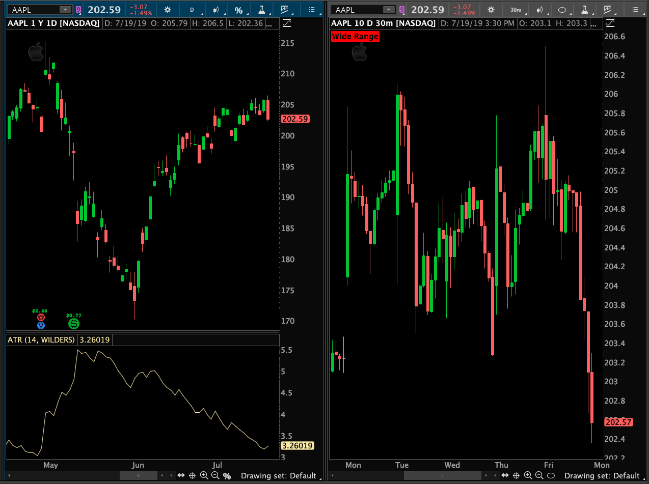
That's it.

Screenshot below shows the results. Notice the fixed values used in this solution are not suitable for AAPL. The daily ATR is currently at 3.26, and is near the bottom of its range over the last three months. For certain, the current ATR value for AAPL is "Very Tight". Yet the label displays "Wide Range". A better solution would account for this through the application of some basic math formulas.

Attachments:
Marked as spam
Posted by (Questions: 37, Answers: 4090)
Answered on July 21, 2019 10:14 am
0
I’m attempting to adapt this code based on the ’professional traders’ perspective foe the ATR. My issue is regardless of the actual range percentage, the background is always GREEN. Any suggestions? AddLabel(yes, “Daily ATR: “+ATR, if ATR > 1.00 then Color.GREEN else if ATR > .50 then Color.YELLOW else Color.WHITE);
( at October 24, 2019 3:46 pm)
0
ATR is a measure of true range. It is not a percentage value. It is a value computed from the highs and lows of the stock. So the values that are relevant will vary widely from one stock to the next. Because the price of the stock will influence the end result. For example the ATR of AMZN will be drastically higher than that of AAPL. Not sure that answers your question. But things should clear up for you if you plot the ATR study on your chart and flip through several charts to see how the values change.
( at October 24, 2019 7:33 pm)
0
I understand what ATR is, it seems my implementation on how to use it is off. What I was looking for was another indicator on present volatility. However, if I wait for it to be green, I've probably missed any legit move. Thanks for the input.
( at October 25, 2019 8:51 am)