Custom Watchlist Columns Colored to Match Dots on TTM Squeeze Centerline

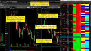
Thinkorswim Watchlist TTM Squeeze
This video shows how to add a column to any watchlist displaying red or green to show you which stocks are in a squeeze. Additionally, this code will count the number of green dots since the last squeeze ended. Zeros mean the stock is in a squeeze. Values greater than zero indicate a stock that has exited the squeeze and is potentially ready for a big move. You can sort the watchlist by this column so you can spot the stocks that have just recently exited the squeeze.
Be sure to watch the video so you understand how to install it. This indicator compliments a previous video we published that displays the colors of the TTM Squeeze histogram in a watchlist. Use these together to create a ‘radar screen’ similar to those used in TradeStation. In a single glance you can see stocks that are ready to make a move and which direction the indicator is predicting.
John Carter’s TTM Squeeze is a licensed study available free on the Thinkorswim platform. This code does not expose any source code as it is fully protected by the Thinkorswim platform.
DISCLAIMER: I AM NOT A CERTIFIED FINANCIAL ADVISOR AND NOTHING IN THIS VIDEO OR TEXT IS AN ADVERTISEMENT OR RECOMMENDATION TO BUY OR SELL ANY FINANCIAL INSTRUMENT. NOR IS THIS VIDEO OR TEXT INTENDED TO INSTRUCT YOU ON HOW TO MAKE BUY OR SELL DECISIONS USING ANY OF THESE INDICATORS.
*Thinkorswim is a chart analysis platform offered by TD Ameritrade: www.tdameritrade.com
TD Ameritrade provides financial services including the trading of Stocks, Futures, Options and Forex.
Please be sure to share this page with your friends and colleagues. Leaving comments below is the best way to help make the content of this site even better.
input price = CLOSE;
input length = 20;
input nK = 1.5;
input nBB = 2.0;
input alertLine = 1.0;
def squeezeDots = TTM_Squeeze(price, length, nK, nBB, alertLine).SqueezeAlert;
def alertCount = if squeezeDots[1] == 0 and squeezeDots == 1 then 1 else if squeezeDots == 1 then alertCount[1] + 1 else 0;
plot data = alertCount;
data.AssignValueColor(if alertCount > 0 then Color.BLACK else Color.WHITE);
AssignBackgroundColor(if alertCount == 0 then Color.RED else Color.GREEN);
Hi Pete. I’m new to trading, but I’ve found your videos very helpful. I added the scripts as you’ve shown in the videos, but I’m having an issue with corresponding colors from the watchlist to the charts. You’ve shown how to fix the mismatched colors in one of the videos and I followed those steps, but in the watchlist customization the thinkorswim software does not have a box to uncheck the “extended trading hours” and in this version of software there isn’t “extended trading hours”.
My question is for the three charts: daily, weekly, monthly, what does the time interval and aggregation period need to be set to?
The simple answer…. Daily, weekly and monthly. Each custom column in a watchlist is set to it’s own time frame. When set to daily time frames or higher, there will never be an option to “include extended hours”. It has nothing whatsoever to do with the version of the current platform.
Thanks Pete, one thing I learned over the years that sometimes it’s user error, and in this case it was user error. I had the month set to day, and although I thought I checked it, I still missed it.
Hi Pete, I need to admit you alert count is genial, simple and elegant. It took me a bit to understand the reverse logic of the squeeze resting period (the red dots). You figured it out. Hat tip.
I am just learning about squeeze with fired. However, it will b e nice if hou explain to me all these colors means, light blue, dark blue or yellow? I understand red and green but not other colors significnace.
Thanks.
That was the other video in this series. That other video displays the colors of the histogram in a watchlist. Just use the navigation menu at the left hand side bar to locate videos of interest.
Hi Pete,
First off, thanks for the great content. Secondly I was wondering if there was a way to have two rows per ticker symbol in a watch-list? Essentially wanting to know if i can structure my watchlist to have a the squeeze dots and and squeeze histogram stacked on top of each other as rows (vertically), and then use the different columns for different time frames.
Thank you!
That would require a major update to the platform from the developers are Thinkorswim. Nothing we can do to make those changes on our own.
Understood. I thought that might be the case but I figured it was worth asking! I suppose the more feasible alternative would be to combine some of the code in a way that colors the background via the histogram and also populates the numerical value based on the squeeze dots. Because while the background color of the squeeze dots helps visually, the numerical value also tells you when its in the squeeze. Would this be a difficult edit?
For me, it is within reach. For the average person that does not write code all day for their occupation, it may be impossible. But even for me it’s quite a bit more complex than something I can do for free.
Hi Pete, could you help create a script for customs watchlist column, color coded for SMA or EMA crossovers? I am sure many will really appreciate this.
Check the Q&A forum. There have been numerous requests for something similar. If you don’t find one that fits your particular use case then post a new question in the forum.
Terribly sorry, English is my 2nd language, I have very hard tiem navigating in Q&A. I figured out 100% your instructions for customizing TTM Squeeze indicator and even managed to change colors in watchlist. Could you please help with scrit where I can get EMA or SMA crossover custom watchlist view, where I could in addition be able to change value of EMA and SMA for example 5 and 8 or 5 and 13 or 20 and 50 etc. Many thanks.
I do not provide custom solutions in the comments section of a video. There are only two places where I provide solutions. One is the Q&A forum, where I have provided well over 1,400 custom solutions to date. The other method is through my professional services, which I don’t advertise because I already have all the work I can get to. I am sorry that a language barrier prevents you from making use of our Q&A forum.
Additionally, if you want learn how to construct your own without knowing how to write a single line of code you will want to view the following video: https://www.hahn-tech.com/thinkorswim-condition-wizard-watchlist/
Hello, is there a way to add time frames to TOS in Watchlist Scritp writer menu. I can only install your TTM squeeze Dots indicator in my watch list with given list of time frames, what if I want to add customized time frame like 39 min, 78 minutes, 195 minutes. THIS WOULD HELP HUGELY, please help me solve this problem.
Sorry but no. There is no way in Thinkorswim to create custom aggregation periods from code. Those will have to be added by the developers of Thinkorswim. So if this is really crucial to your ability to trade successfully then be sure to contact TDA support to request they add custom aggregations to custom quotes.
Thank you Pete!
Hi Pete, I’m new here and learned tons of new stuff how to setup TDA on your website so far. I have question I copied the code and it works fine, but only shows green and red. As your video it actually shows the background color that matches TTM Squeeze Wave bar. Can you help me on this?
That’s a different video. And it’s not the TTM Wave but rather the TTM Squeeze Histogram. From the left hand side menu, you will find it is the one immediately above this one. You can use this direct link to get there: https://www.hahn-tech.com/thinkorswim-ttm-squeeze-watchlist/
Thank you so much Pete
nvm, I searched on your site and i find that you make another video on the color. Thank you 🙂
So now that you we learned from this video – thanks to your clear explaination – how to set up our platform, I know that you dont teach people how to trade but any advice or a link to where can we learn how to best use this strategy
(what is the best color combination need to look for between multiple timeframe to determine a trade timing)
Thank you
Sorry but I have no opinion on that topic.
Hello,
Could you please advise what I need to modify in this script so it will show a count in the red cells ( to know how many counts the stock has been in the squeeze )
Thank you
If you don’t find a solution in the Q&A Forum…
https://www.hahn-tech.com/ans/cat/watchlists/
… be sure to post a new request there.
Thank you for all your amazing help Pete.
I have an issue with a custom code I am writing up.
def Buy = RSI < 30;
def StrongBuy = RSI 70 ;
def StrongSell = RSI >75;
def NoBuy = not Buy and not StrongBuy and not Sell and not StrongSell;
I know there are other ways around this. But really want to use the feature “not” due to some of my other code being alot more complicated and not as easy to code to not fall under 70 and above 30.
Thank you.
Exclamation mark immediately in front of any true/false value serves in pace of “not”. So “!Buy” means Buy is not true.
Thank you for the content Pete, its always appreciated.
I put the squeeze dots on my watch list. I noticed that sometimes the watch list shows that the stock is in a squeeze and when the dots are green on the chart. I double checked the time on the chart with the time on the watch list indicator and it matches. Im thinking that the stock is squeezing but it hasn’t closed yet. Any idea?
Thank you.
See if this solution posted here clears thing up: https://www.hahn-tech.com/ans/hourly-adx-watchlist-not-matching-hourly-chart/
Worked Perfect. Thank you.
I get only one green column with numerical values to the right of the column.
I just tested the code and it’s working fine. Make sure you have set the correct time frame and copied the code correctly. If you still cannot get expected results then post a new question in our Q&A forum.
Understand now, but it would be helpful for you to explain each of the columns and when and where they were added, and what the names of them represent. Adding this particular column is only a part of the picture.
Hmmm… that probably means you need to watch the other video. This one covers the color of the dots on the centerline of the squeeze. There is another video that covers the histogram colors. https://www.hahn-tech.com/thinkorswim-ttm-squeeze-watchlist/
Hi Pete, setup the TTM Squeeze watchlist as indicated in your video but the horizontal red and green dots showing up as one thick continuous line.
Any idea what went wrong in my setup?
“…horizontal red line…”. Yep, something is definitely wrong. Because this code is designed for a custom column in a watchlist. You tried to put this on a chart?
Watchlist TTM Squeeze judt shows loading
That’s going to happen from time to time and there is nothing you can do about it. The issue is on the servers that run Thinkorswim. We (the users of the platform) have no control over that.
I figured it out. The symbol watchlist scripts don’t work on the TOS simulated trading platform, but they do work on the TOS live trading platform.
Good Day Pete,
I am trying to create a scan that will display multiple stocks and their TTM squeeze dot status on one screen, bottom area. For example, I want to watch for when Stock1, Stock2, and Stock3 are in a squeeze. I would like it displayed on the chart instead of a watchlist. This way, one chart shows this indicator for those selections.
Thanks TONS!
Rose
Thanks for the feedback Rose. You can submit a custom project request for this. Be sure to check our rates and terms on this page. Fill out the contact form at the bottom if you want to submit this as a custom project request: https://www.hahn-tech.com/about/
Thanks for the video. Looking to change time frame – on Custom Quote Formula. I see how to change to a standard Time Frame (daily, 1 minute, 5 minute, etc.). In Time Frame setup I have established my favorite time frames – such as 195 minutes. What would I need to change in your setup to be able to use a column in the watchlist for the squeeze on a 195 minute frame. Thanks. Todd
Only standard time frames are supported for custom watchlist columns.
Thanks for the response Pete.
The green dots show totals of number of occurrences, the red dots do not…can this be fixed?
“Fixed”? Nothing is broken, that is the intention. According to John Carter the number of red dots do not matter. Therefore the code does not count them. You are welcome to post a request in the Q&A forum asking for a modification. Be sure to search the forum first to make sure someone has not already requested this.
Hello Hahn. Is there a code that will also add the TTM wave color and TTM trend indicator colors to my watchlist? If the TTM wave is positive the color would reflect as blue if negative red. If the TTM trend is positive the color would reflect as blue and if negative red.
Search our Q&A forum. Pretty sure we’ve covered these items there.
Thanks for all of the great content Pete. I have my watchlist setup with D_Sqz and W_Sqz but having trouble finding the coding for the daily and weekly direction change. Where can I find the direction color code?
By “direction change” do you mean the watchlist that changes color to match the colors of the histogram of the TTM Squeeze? Did you check the green menu on the left sidebar at the top of this very page?
Thanks for this. This is very helpful. Is it possible to make one for TTM Trend also? Would love to have one for the Squeeze and the trend. Thanks
Search our Watchlist topic in the Q&A forum for the term “trend”. Second item in the results list: https://www.hahn-tech.com/ans/cat/watchlists/?question_type=all&search=trend
Thanks. Got it up and running. This makes everything much easier
Peter, instead of using TTM Trend what if I wanted to use ma’s instead? It would work the same as the TTM trend in regards to color and everything but would use the MA Cross. It would also show how many bars back it crossed like the TTM Squeeze. For ex., 21 MA ( Simple, Exponential) crosses above the 50 MA it would be colored green for an uptrend and colored red when 21 is below the 50. Hope this makes sense. Not even sure where to begin with this. Thanks
I have already made one of these for a client who paid for it as a custom project. Sorry but I cannot make this public, out of respect for the client who paid for it.
Thanks Peter. Is it for sale and how much?
Please submit a custom project request by filling out the contact form at the bottom of this web page. We can discuss the details via email. Thanks! https://www.hahn-tech.com/about/
Great, just did it. Thanks
Is it possible to create a scan for when ADX is at the top of the range with DMI- and the existing stoch/macd scan? I like to find the lowest price action and ADX is at the top, DMI- is with it and then we get the stoch/macd ‘spike’ and the price moves up. Is it possible to combine that into one scan?
Sounds like it’s possible. You will need to post this in the Q&A forum and provide a screenshot showing at least one of these signals you want the scan to pickup. Make sure the screenshot shows the entire chart so we can replicate it our platform. The title of the question should be 6-8 words and clearly describe the context of your request. Avoid meaningless phrases in the title such as “How to”. The question title should be very similar to what you would used to search for this solution. Have you searched yet?
Pete, thanks for the scans I did weekly and daily but I would like to do 4 hour and 1 hour but it doesn’t come out right. Is there something I ned to change? Thanks for all your help!
This will most likely address the issue: https://www.hahn-tech.com/ans/hourly-adx-watchlist-not-matching-hourly-chart/
getting a lot of NAN black box on squeeze watchlist. is there a reason for this?
As I said. I just tested this on my end and it’s working fine. The problem must be on your platform.
I really like your watchlist that tracks the Squeeze. Is there a way to count the length of the Squeeze(Reds). Knowing how long the Squeeze has been is important to me.
Check this post in our Q&A forum. This is for a scan but the code is quickly adapted to a watchlist. Just compare the code from this video with the code in this post. https://www.hahn-tech.com/ans/ttm-squeeze-scan-that-looks-the-number-of-red-dots-in-a-row/
Hi. I have created the watchlist for the Daily and Weekly. But all they show are red and green…….no light blue, dark blue or yellow. Can you tell me if there’s addition code that needs added for those?
There are two videos. This one does the red and green dots of the TTM Squeeze. The other video does the changing colors of the histogram: https://www.hahn-tech.com/thinkorswim-ttm-squeeze-watchlist/
This was explained in the video.
Thank you so much!!
Hello, great video! I’m having an issue though, I copied the code but the watch list just says “loading”. Can you please tell me what I did wrong?
There may not be anything wrong. Could be many temporary causes for this. Check it again during market hours on Monday and see if it begins to work.
Thank you
TTM squeeze dots, it is showing only for green dots and number of green dots. For red dots, it is not showing number or red dots (always shows zero). Please post this if it requires programming change?
You are correct. This was explained in the video. The number of red dots do not matter, according to the author of TTM Squeeze John Carter.
thank you for quick reply. I would like to see number of red dots also, like number of green dots in TTM squeeze, please post what changes are required in the programming code.
Thank you
There are many posts on this topic in our Q&A forum. I encourage you to browse through there to see what has already been requested and resolved. I believe you can adapt this code to display the count of red dots in a watchlist: https://www.hahn-tech.com/ans/ttm-squeeze-scan-that-looks-the-number-of-red-dots-in-a-row/
Hi Pete, On the TTM squeeze I wanted to setup a trigger (Plot) on the COLOR of the BAR. For Example if the COLOR is LIGHT BLUE or YELLOW then setup an alert. I see you did something similar in the video above. I am planning to use the color of the bar along with the MACD and stochastic indicator. I wrote the initial lines of code, but I am not sure how to get to the Yellow Bars.
Thanks
Hilario
————————————————–
input price = CLOSE;
input length = 20;
input nK = 1.5;
input nBB = 2.0;
input alertLine = 1.0;
def yellowbar = TTM_Squeeze(price, length, nK, nBB, alertLine).SqueezeAlert;
Hi Hilario, Thanks for posting this question. I have moved this over to the Thinkorswim forum, in the Watch List category. You can view the question and answer at this link: https://www.hahn-tech.com/ans/alert-on-color-change-of-ttm-squeeze-histogram/
Hi, I was wondering if this script would work with different settings? I am trying to set the alert line at 1.5 but it does not align with the indicator in ToS. is there anything else in the script that needs to change?